Overview
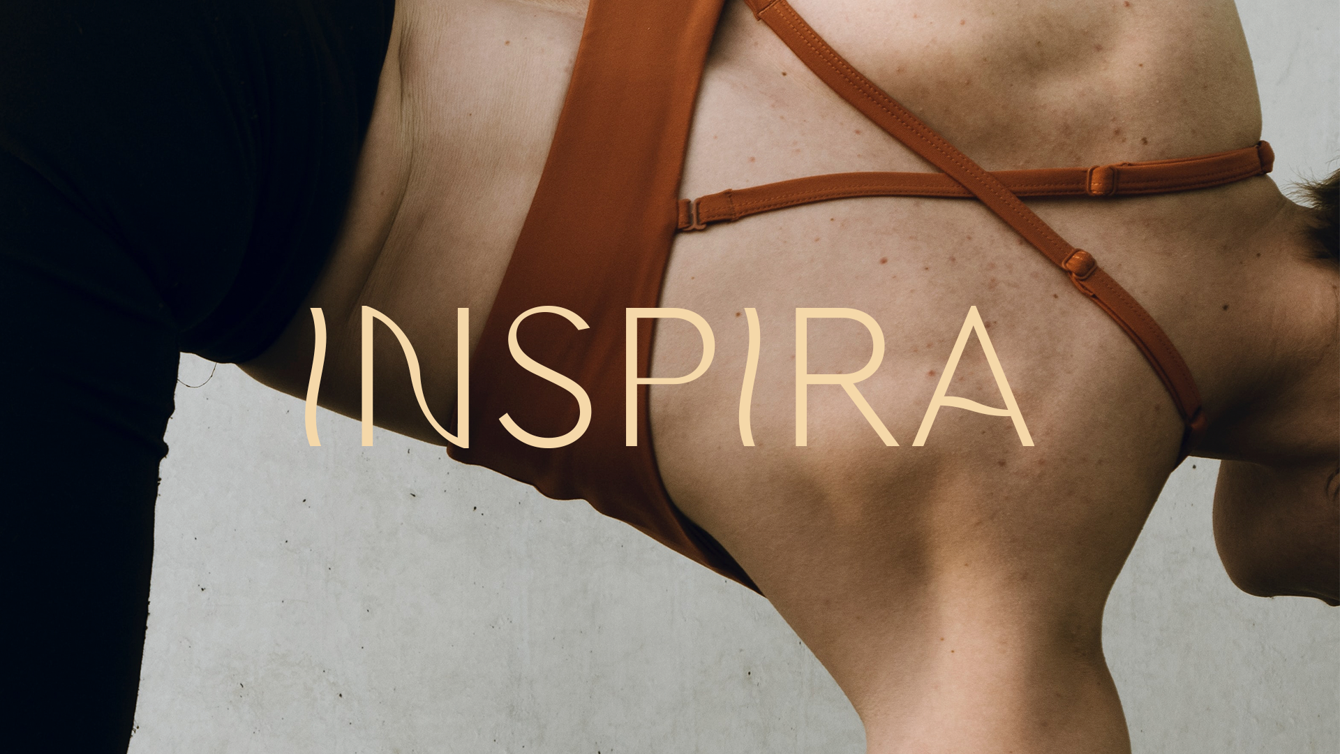
Inspira blossomed from the client’s deep connection to her healing practice. What began as a massage technique exchanged among close friends flourished into a meaningful and rewarding new path.
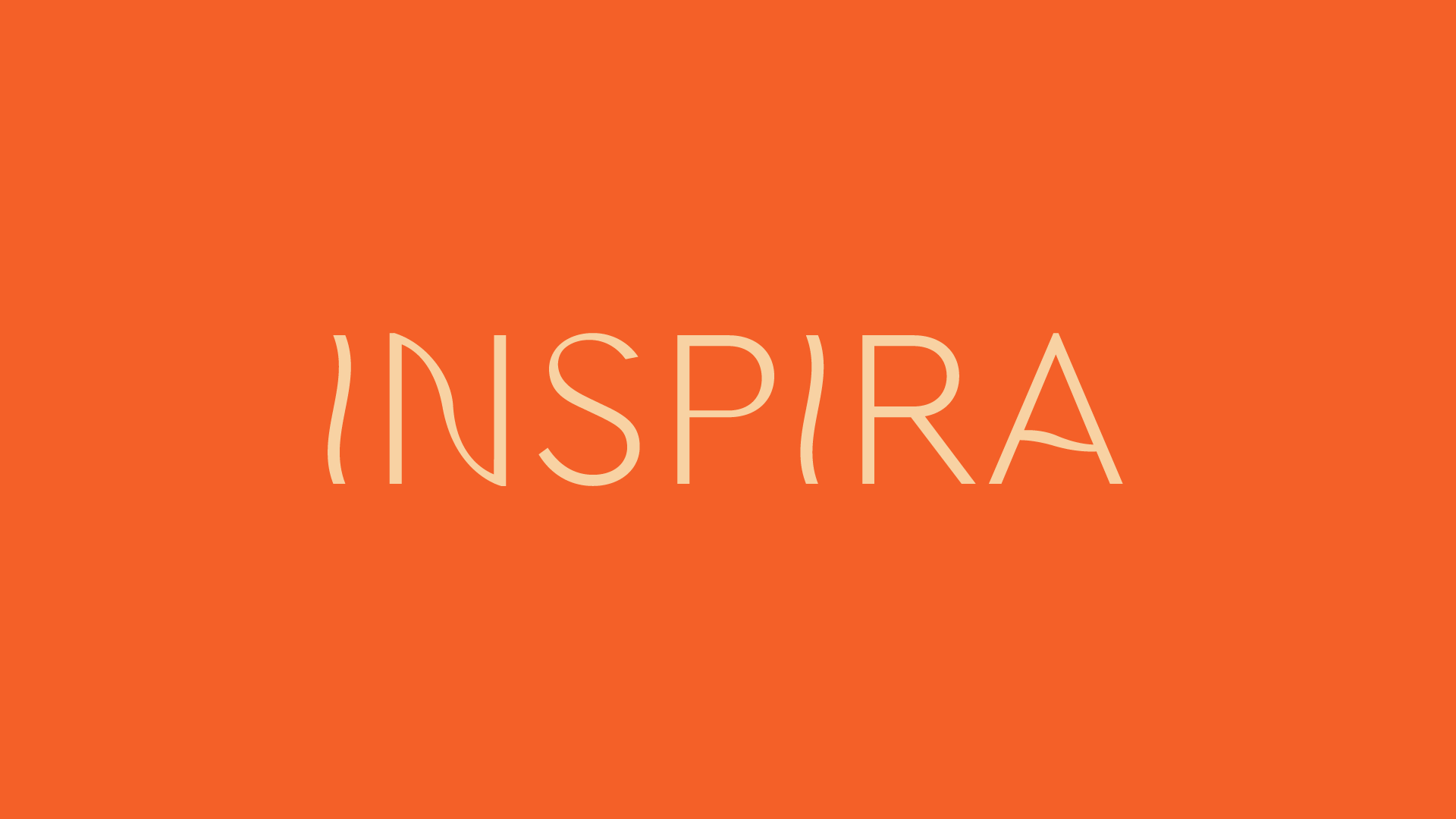
Borrowed from a past dance project, the name Inspira means “inspiration” in Spanish and captures the heart of every session: to uplift, restore, and center each client.
The visual identity captures this spirit, intertwining touch, movement, and mindful presence into a brand experience that gently nourishes body and soul.
Team: Alexandra Pérez | Daniela Herrera
Challenge
The main challenge was to translate a hands-on approach, guided by her dancer’s intuition, into a brand that exudes professionalism and trust yet remains grounded in movement and tranquility.
The identity needed to harmonize a feeling of safety and sophistication with expressive, flowing energy.
Solution
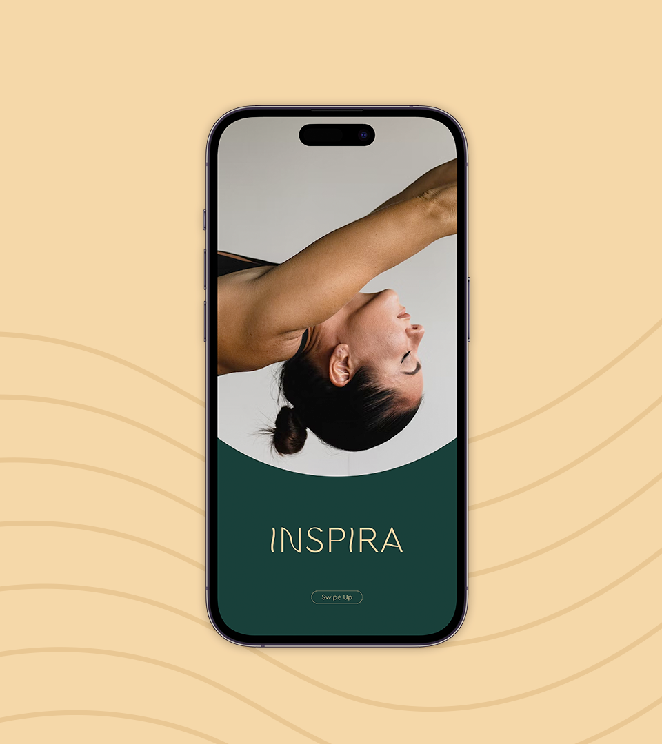
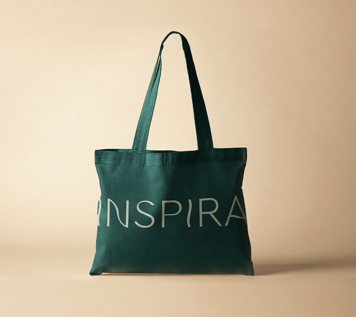
We designed a light, minimalist identity inspired by the language of movement. Drawing from dance and the human form, the logo’s soft curves suggest flow and continuity. This visual rhythm weaves through the brand, connecting every detail with quiet harmony.
A high-contrast palette blends warm, earthy tones with lush green accents, evoking tranquility, confidence, and a grounded sense of belonging.
The result is a brand rooted in movement and sensitivity, radiating gentle strength, trust, and graceful flexibility.


Thanks for taking the time to review this project!
Feel free to explore more of my work below.
Feel free to explore more of my work below.